April 14, 2012

Baby Girl: Soft-Colored (Vintage) Name Frame and Card

This frame was inspired by the arrival of a special baby girl. We chose a soft-colored vintage theme - in doing so, it is better to use a cream/brown palette rather than a black/stark white. The glitter embellishment of the paper, along with the glitter in our ribbon choices, really make this project sparkle without overdoing the glitter effect. I'd like to note that glitter ribbon is difficult to glue/tape down, so be careful if you use it on a project that doesn't go behind glass!

  • The image inside the frame is slightly smaller than a standard wallet. If you give a gift like this, be sure to include the interior cut-out shape so the receiver can cut the picture to size. You could also include photo corners, if properly disguised.
  • The duck was edged with brown distress ink, and given blue eyes like baby girl.
  • We used the hearts from the frame as added embellishment on the left side ribbon.
  • I'd like to also give credit to my (other) Mom Janice for helping me work out the details of this project. I had a wonderful time! :-)

Frame Details: the pink mystical paper is from a paper stack by First Edition Paper called "Spring Feast". The small frame is from Cricut cartridge Elegant Edges, and the letters are from Paper Lace.


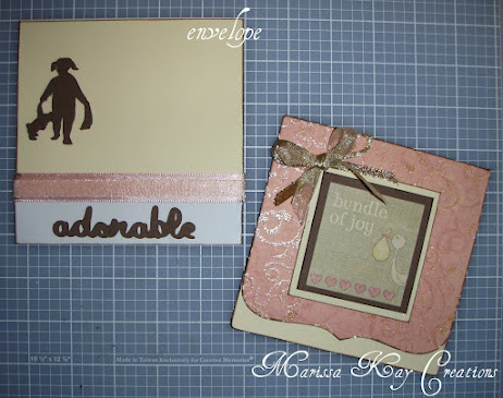
  • Coordinating card to go with baby name frame.
  • Again, everything was edged with brown distress ink for more of the vintage feel.
  • We used two kinds of ribbon and overlapped them for the more elaborate bow - one solid and one sheer.
  • The card is approximately 5inx5in.
  • The interior says "thank heaven for little girls".

Card Details: same pink paper from Spring Feast, paired with large card stock front sticker from the Paper Studio. The girl silhouette and duck are from Cricut cartridge A Child's Year, and the font again from Paper Lace.

April 5, 2012

Rustic Birthday Card


A rustic-looking Birthday card! I love my new balloon stamp, its large size makes it versatile for card making. Each piece of the front was edged with brown distress ink, and brads were used to help keep the tag and leaf on the paper. It goes without saying to make the front of the card first before you tape it to the card itself, because the brads would leave a hole on the interior of the card.

Card Details: Balloon stamp from Stampabilities, the brads from Recollections. Font and front tag are from Plantin Schoolbook, letters welded using the Gypsy. Congrats stamp is from g-studio. I used a brown distress ink from Tim Holtz. And the gold shiny ribbon from Martha Stewart. Basic ivory card and envelope is from The Paper Studio.